

Before the logo, one question: what exactly is Pilgrimages?
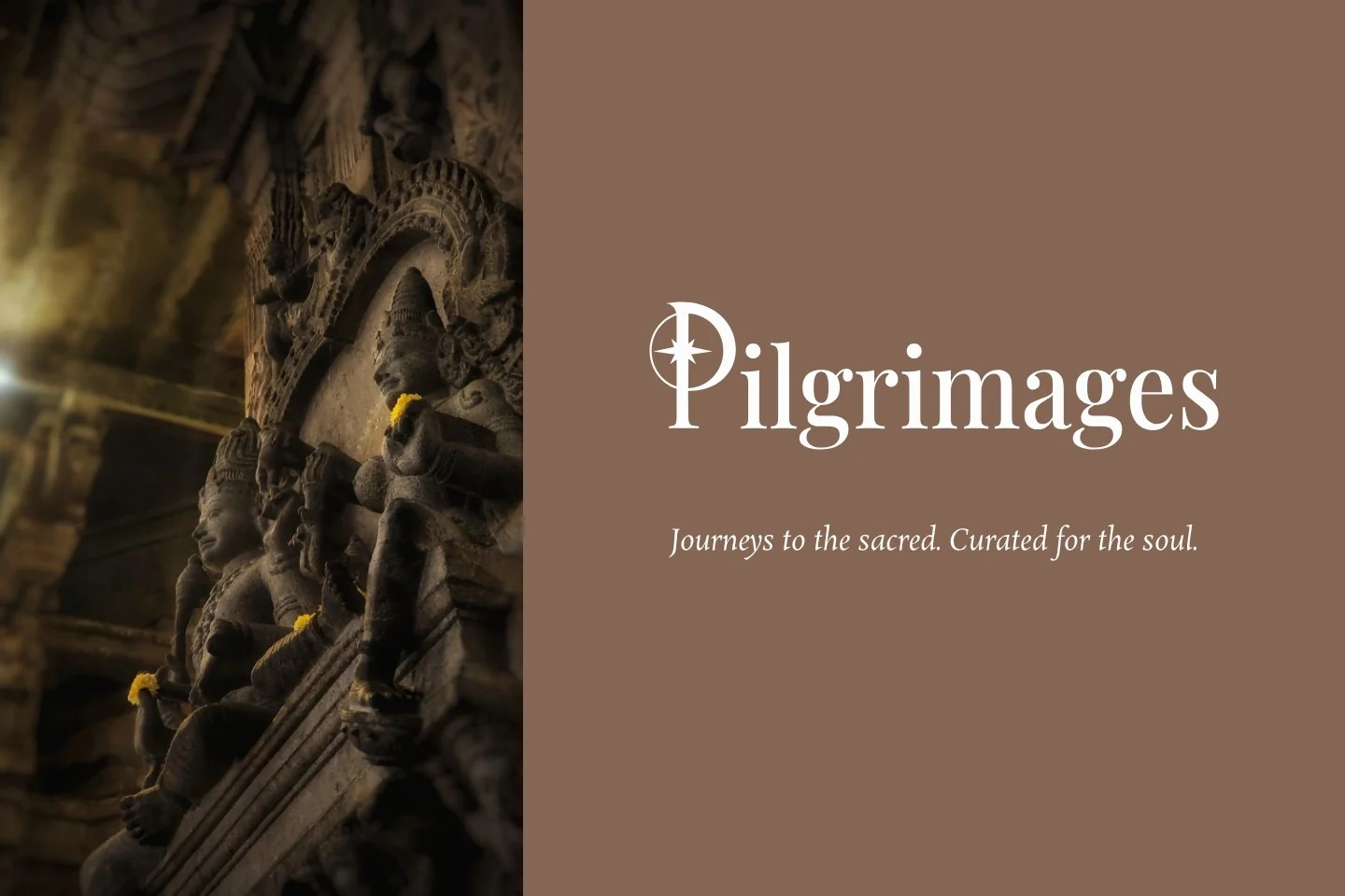
Pilgrimages
PositioningLanguageIdentity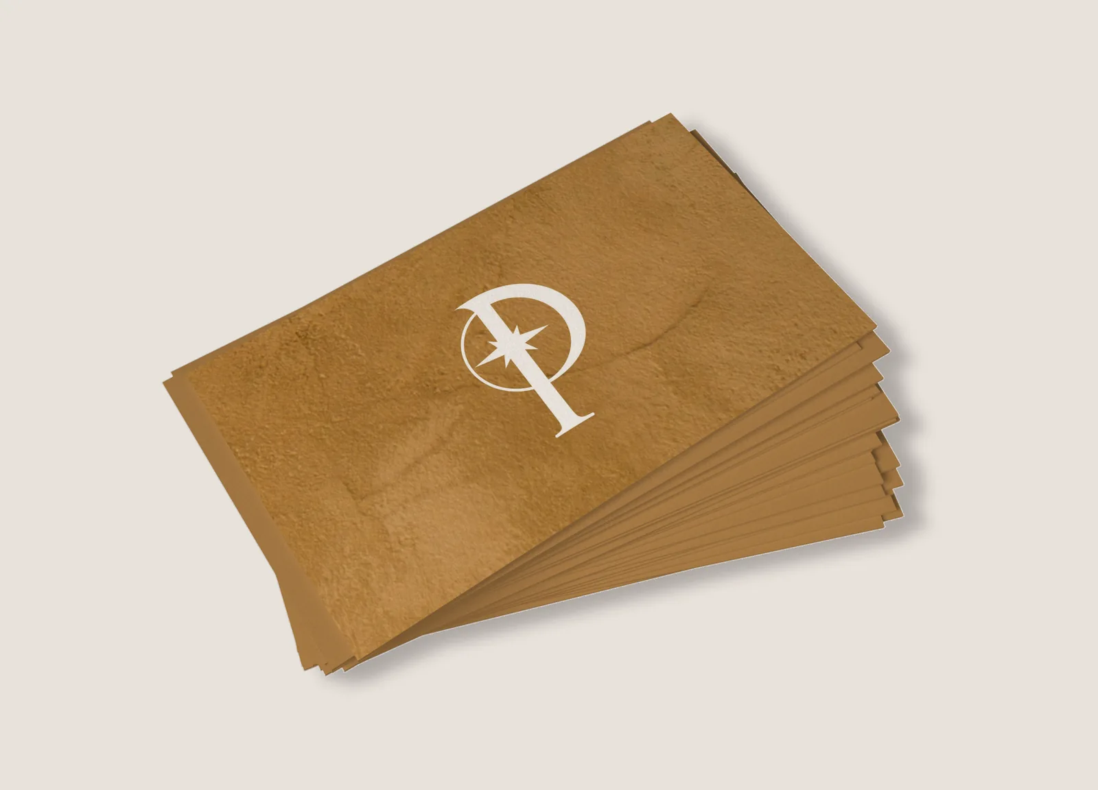
A different kind of travel brand.
Pilgrimages came with an idea: journeys to sacred and cultural places in India, made with the care of the best travel. Before anything could be designed, one question had to be answered. What exactly is Pilgrimages?
Convenience was never the offer.
Its travellers already travel well. They can book their own flights and hotels. What they cannot arrange for themselves is curation, context, access and care.
The question
How does a brand hold spirituality, culture and comfort together without sounding like a pilgrimage operator or a luxury catalogue?
We set the territory first.
Not mass tourism. Not conventional pilgrimage travel. Not luxury for its own sake. Not spirituality as an aesthetic. What was left: meaningful journeys, thoughtfully curated.
And one definition that shaped the rest: luxury is not excess, it is thoughtfulness.
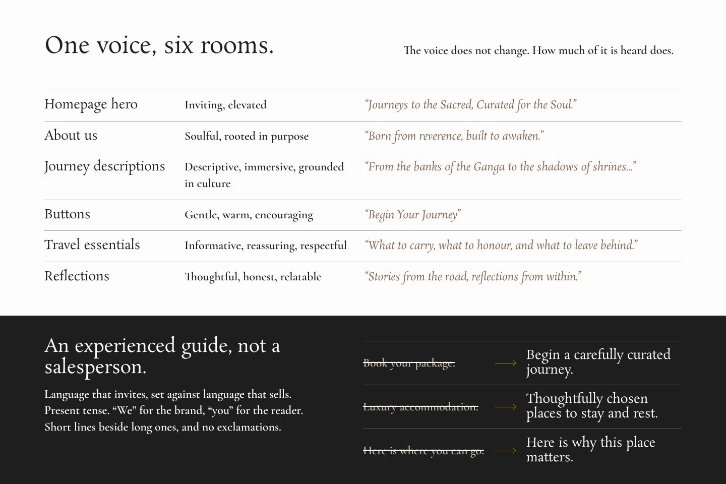
The voice invites. It does not sell.
The brand should sound like an experienced guide, not a salesperson. The button reads “Begin your journey”, not “Book now”.
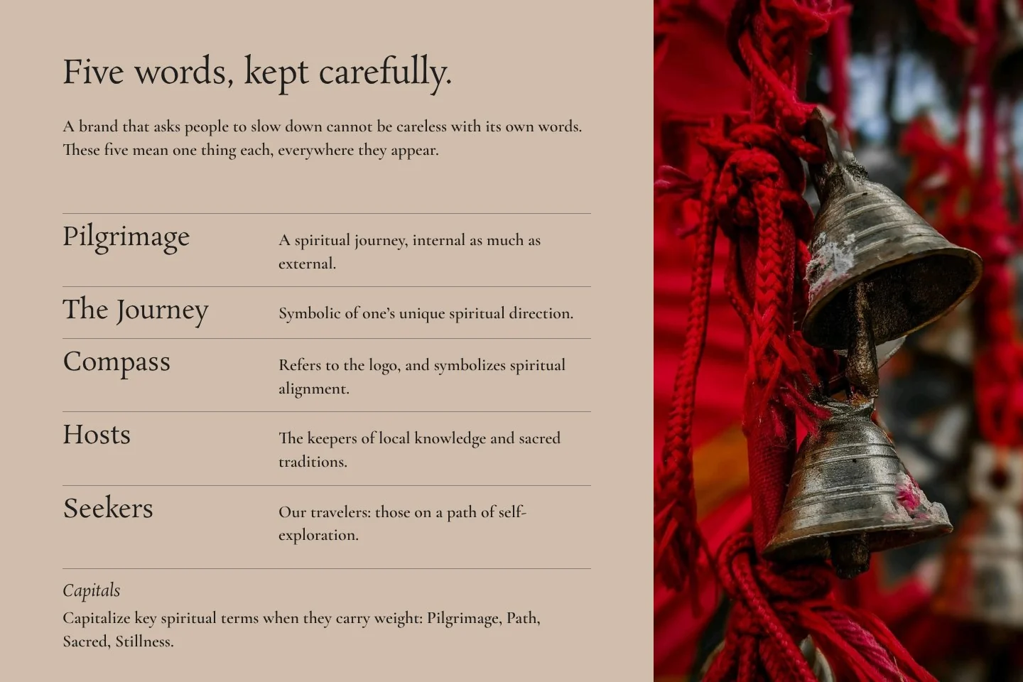
Travellers are called seekers. Guides are called hosts.
It moves the brand from transaction to invitation.
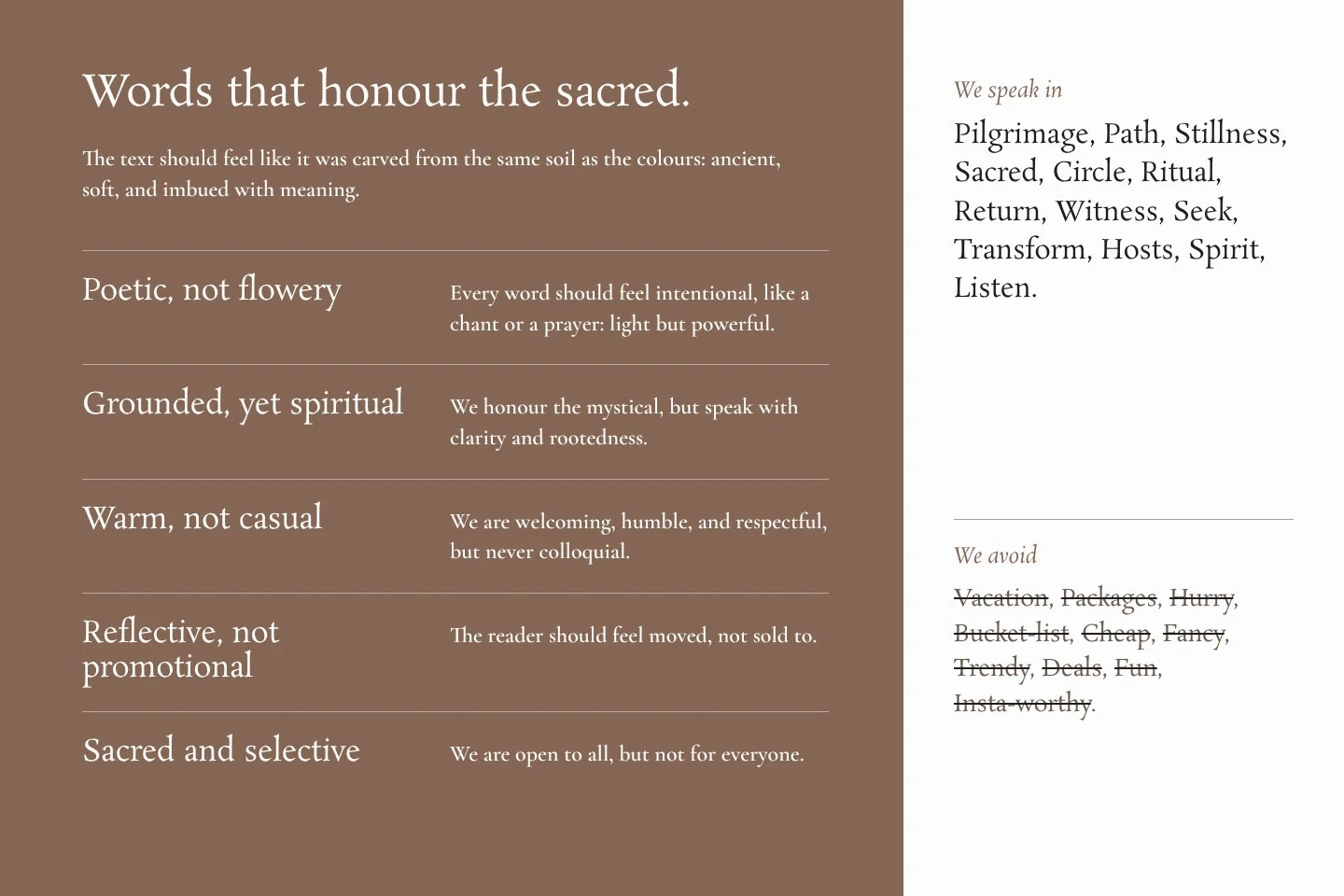
There is a list of words the brand speaks in, and a list it avoids.
A team needs a framework it can use, not a mood.
The word luxury is on the avoid list.
Saying you are luxury does not make you so. We believed the actions should speak.
Tone changes by context: inviting on the homepage, reassuring in travel essentials, thoughtful in the journal.
Words the brand speaks in
Sacred
Stillness
Path
Ritual
Return
Words it avoids
Package
Deal
Bucket-list
Insta-worthy
Luxury
Journeys to the sacred. Curated for the soul.
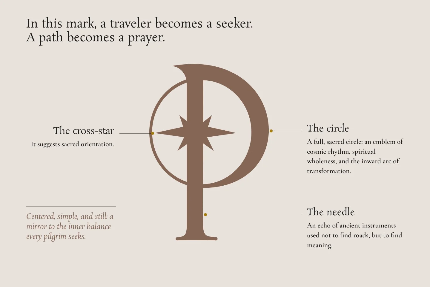
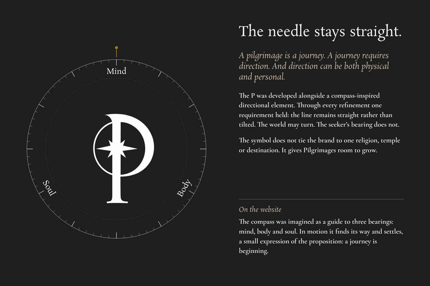
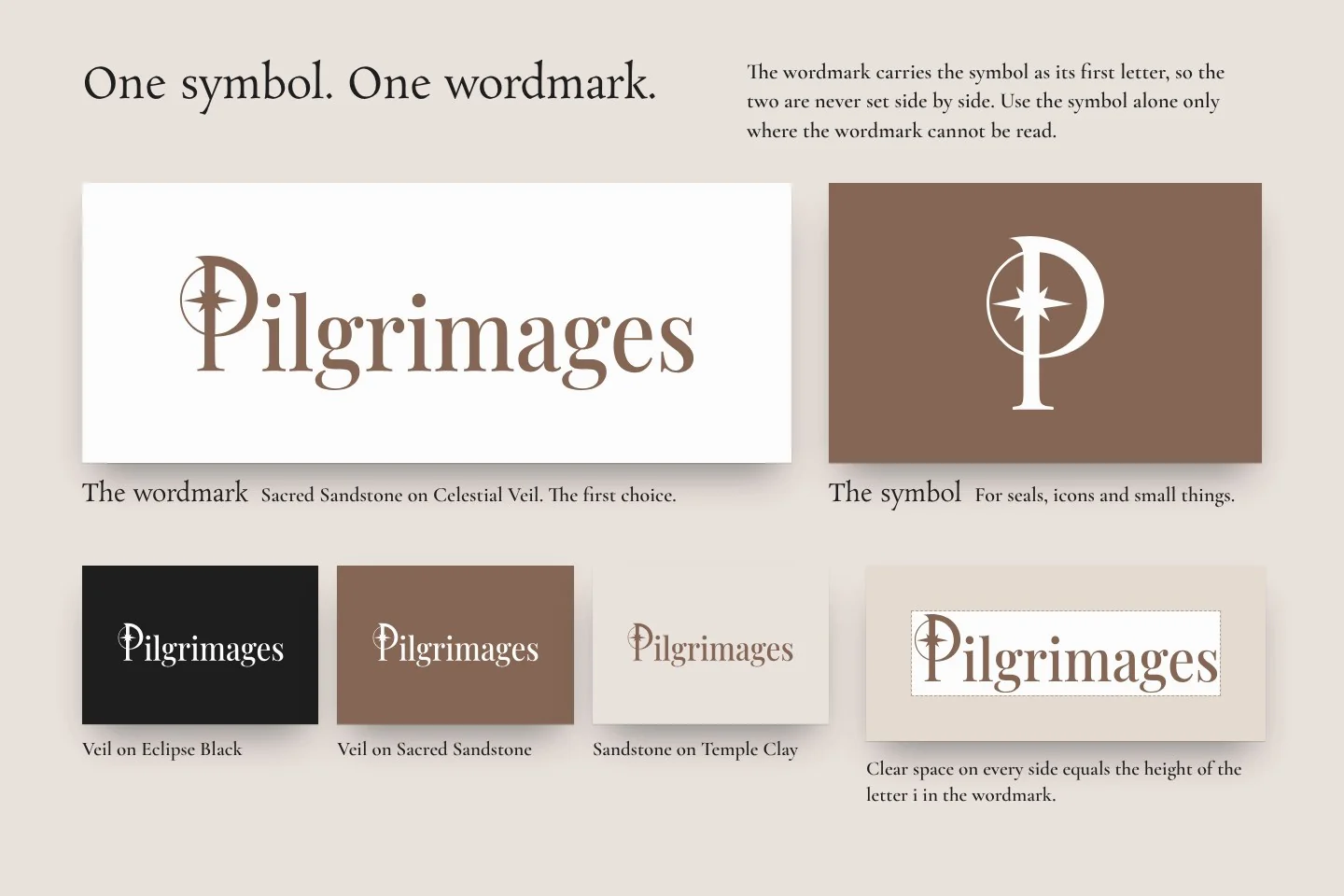
The mark is a full circle holding a guiding needle and a cross-star.
A pilgrimage is a journey, and a journey needs direction. The needle recalls instruments used to find meaning, not roads.
The symbol belongs to no single religion, temple or destination.
It leaves the brand room to grow.
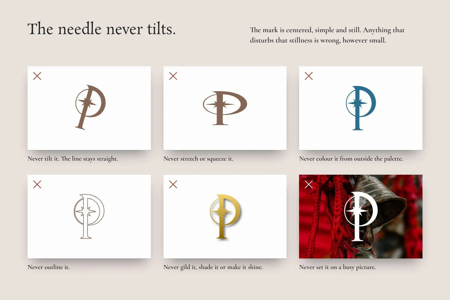
The line of the needle stays straight, not tilted.
This was refined after the first direction was chosen.
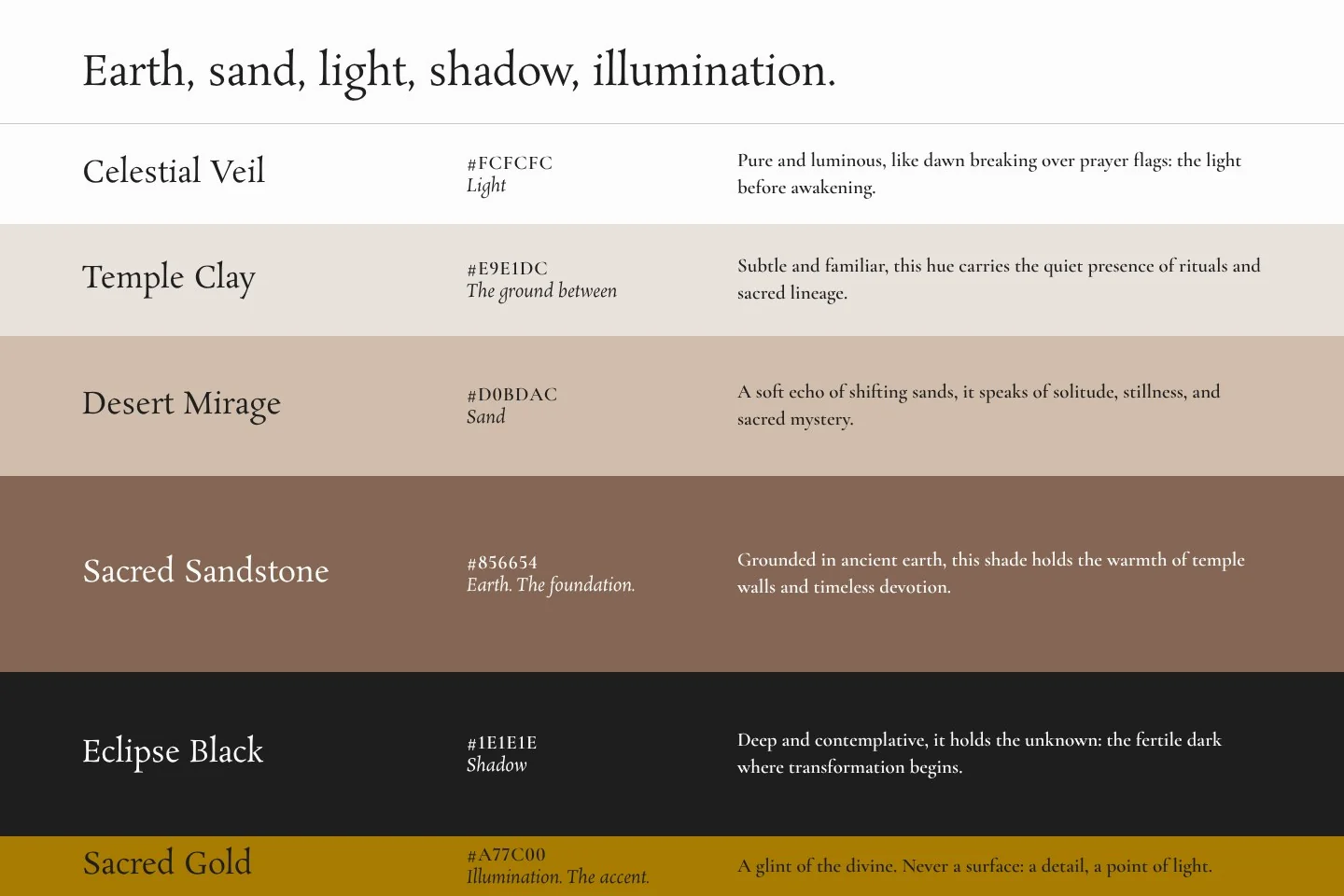
The palette runs from earth to sand to light to shadow, with gold only as an accent.
A black-and-gold palette would have made this one more luxury travel brand.
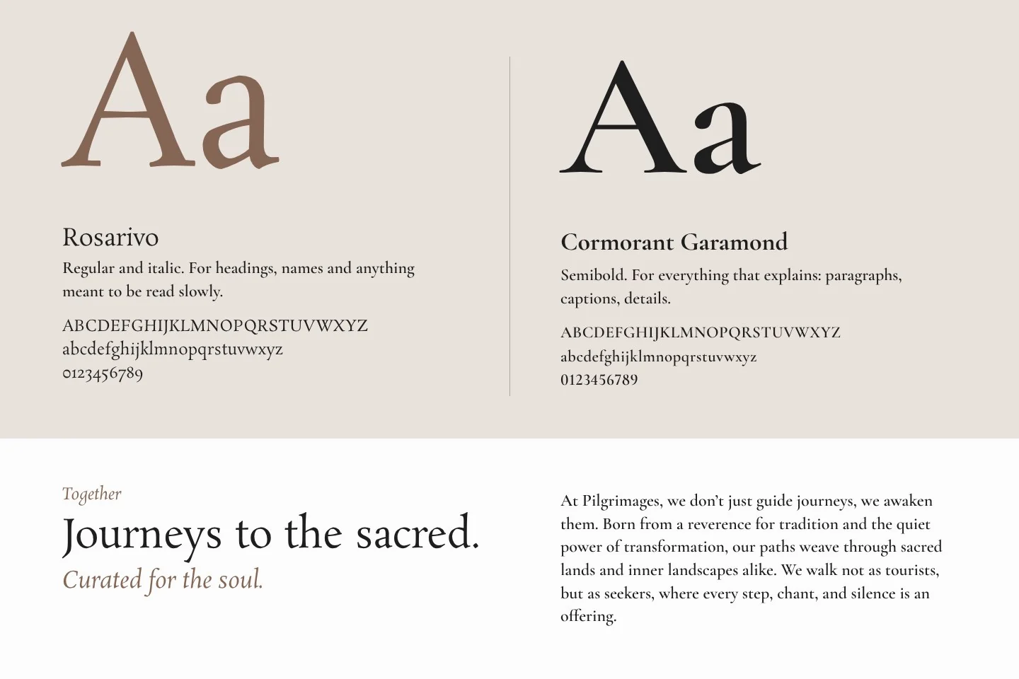
Rosarivo for headings, Cormorant Garamond for text.
Play with it
The needle stays. The world turns.
On the website, the P was imagined as a compass that guides you to mind, body and soul. This is a sketch of that idea. Tell it what you are looking for and the month you were born, and it turns to a sacred place in India whose season that is.
What are you looking for? Something for
When were you born?
The compass is still looking. Choose a month and it will settle.
- For the mind
- For the body
- For the soul
Most of these occasions follow the moon, so their dates move a little each year. The Urs at Ajmer Sharif follows the Islamic calendar, and so over about thirty-three years it visits every month. Bearings and distances are measured, as the crow flies, from the Zero Mile Stone in Nagpur, the 1907 survey marker long regarded as the centre of India. These twelve places are the studio’s suggestions, not a list of Pilgrimages journeys, and an invitation rather than a prescription.
Headings.
Text.
Calm on purpose.
The site moves in five steps. If the offer is unhurried travel, the website should not feel rushed either.
Khatt designed the website. It was built by another team.
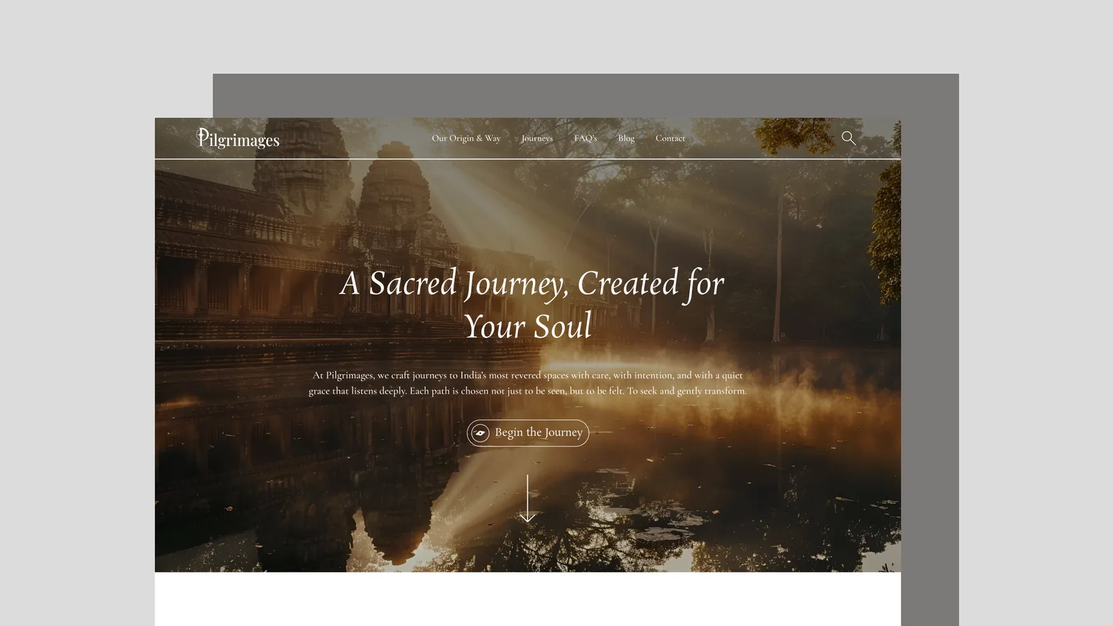
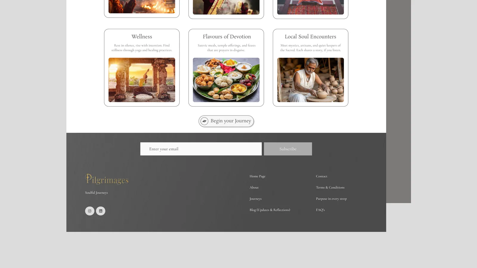
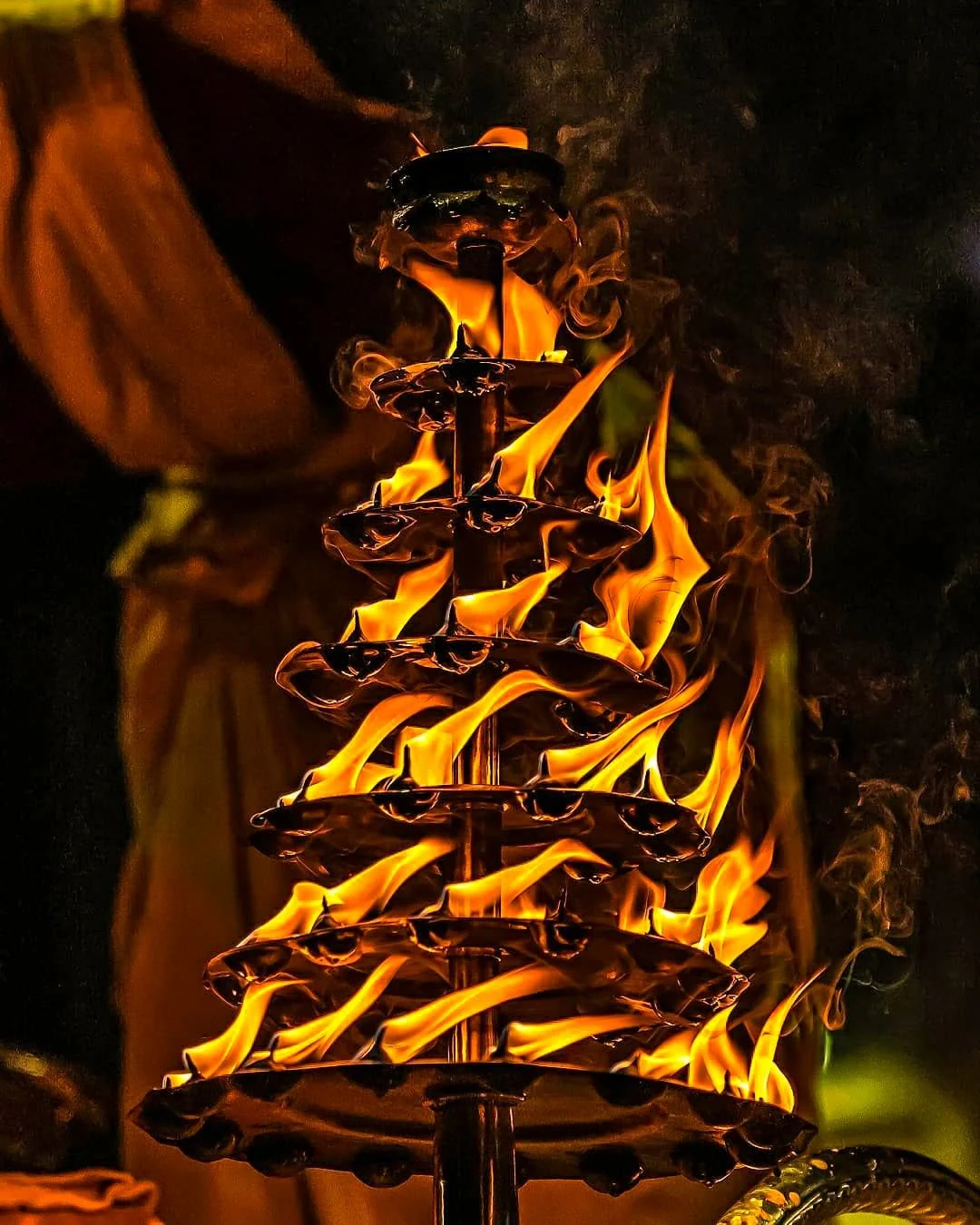
From where you can go, to why it matters.
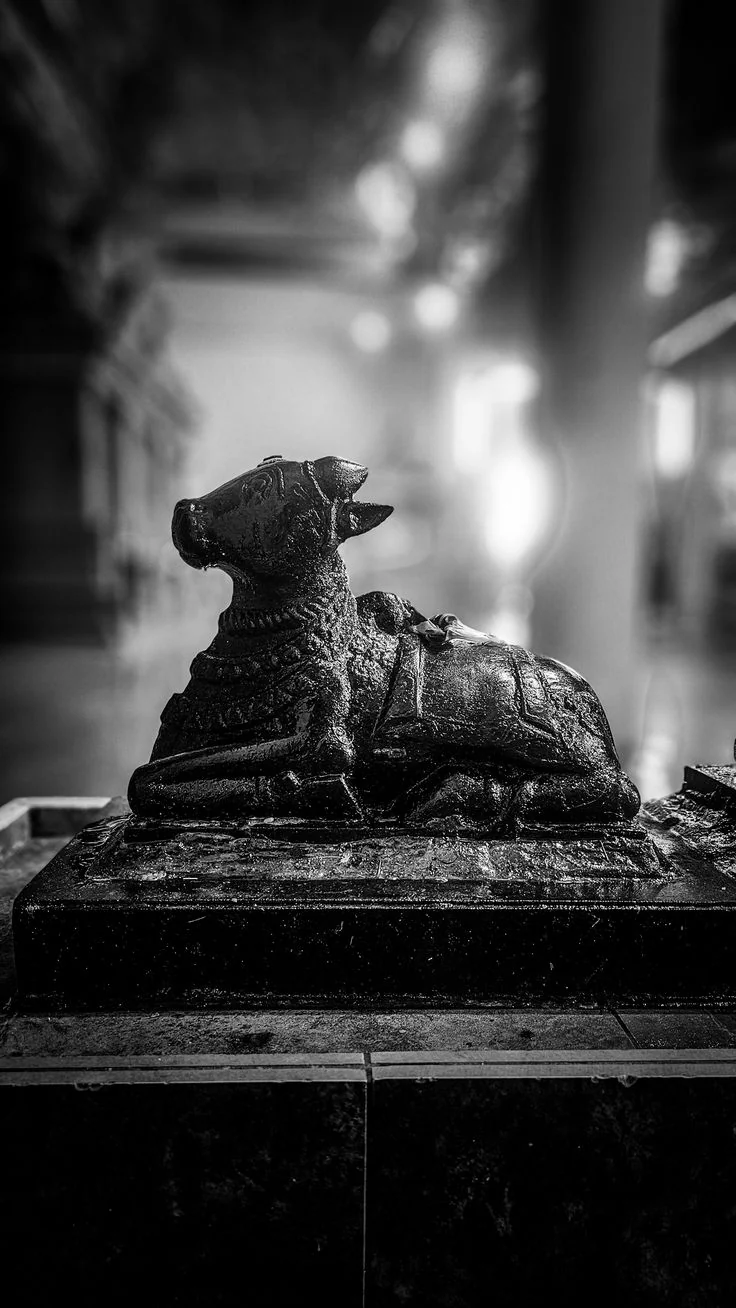
Social moves from “here is where you can go” to “here is why this place matters”.
The brand book, remade
18 pages
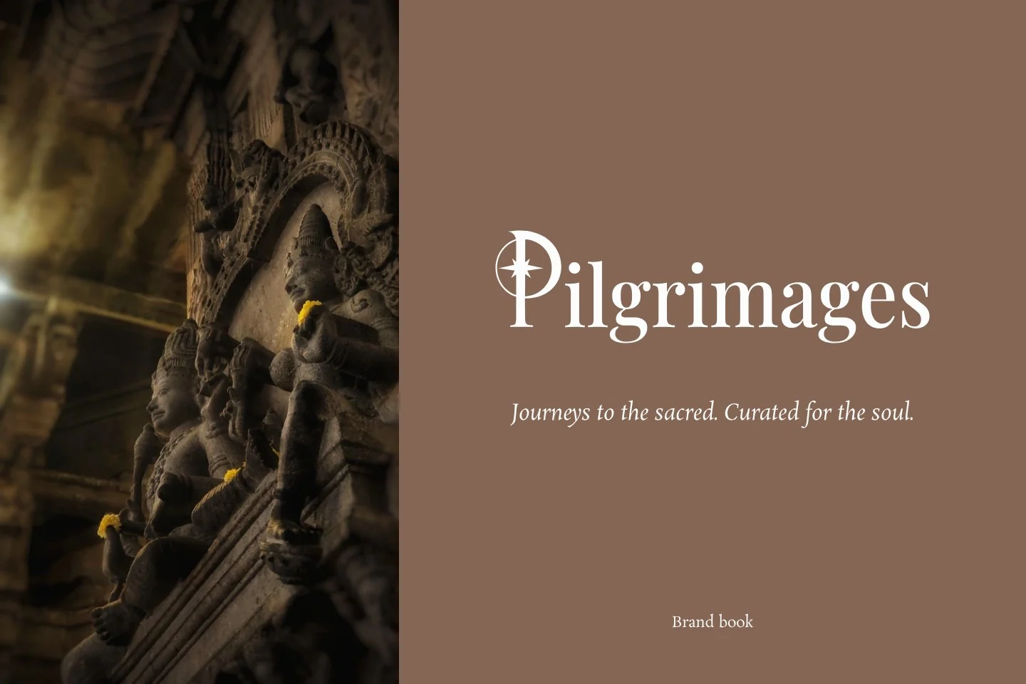
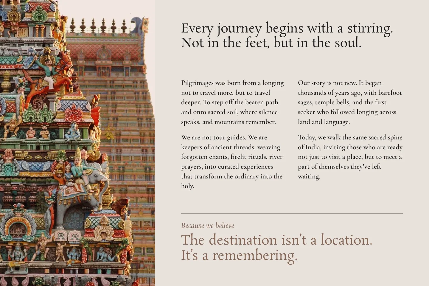
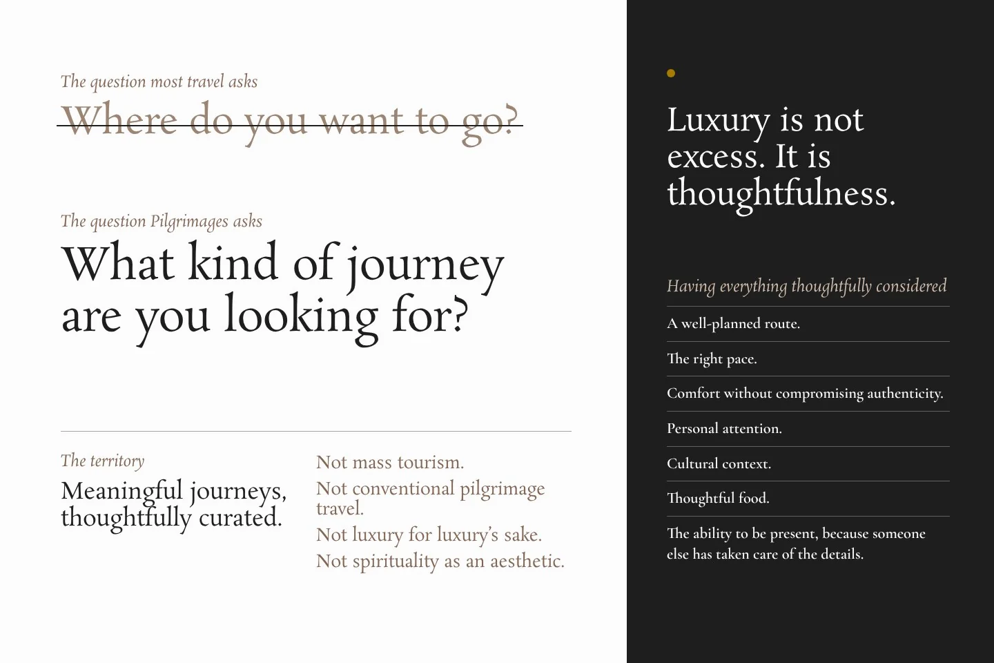
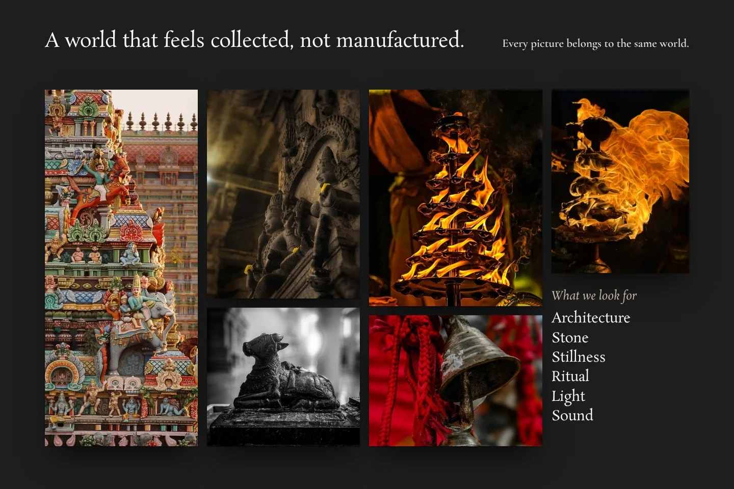
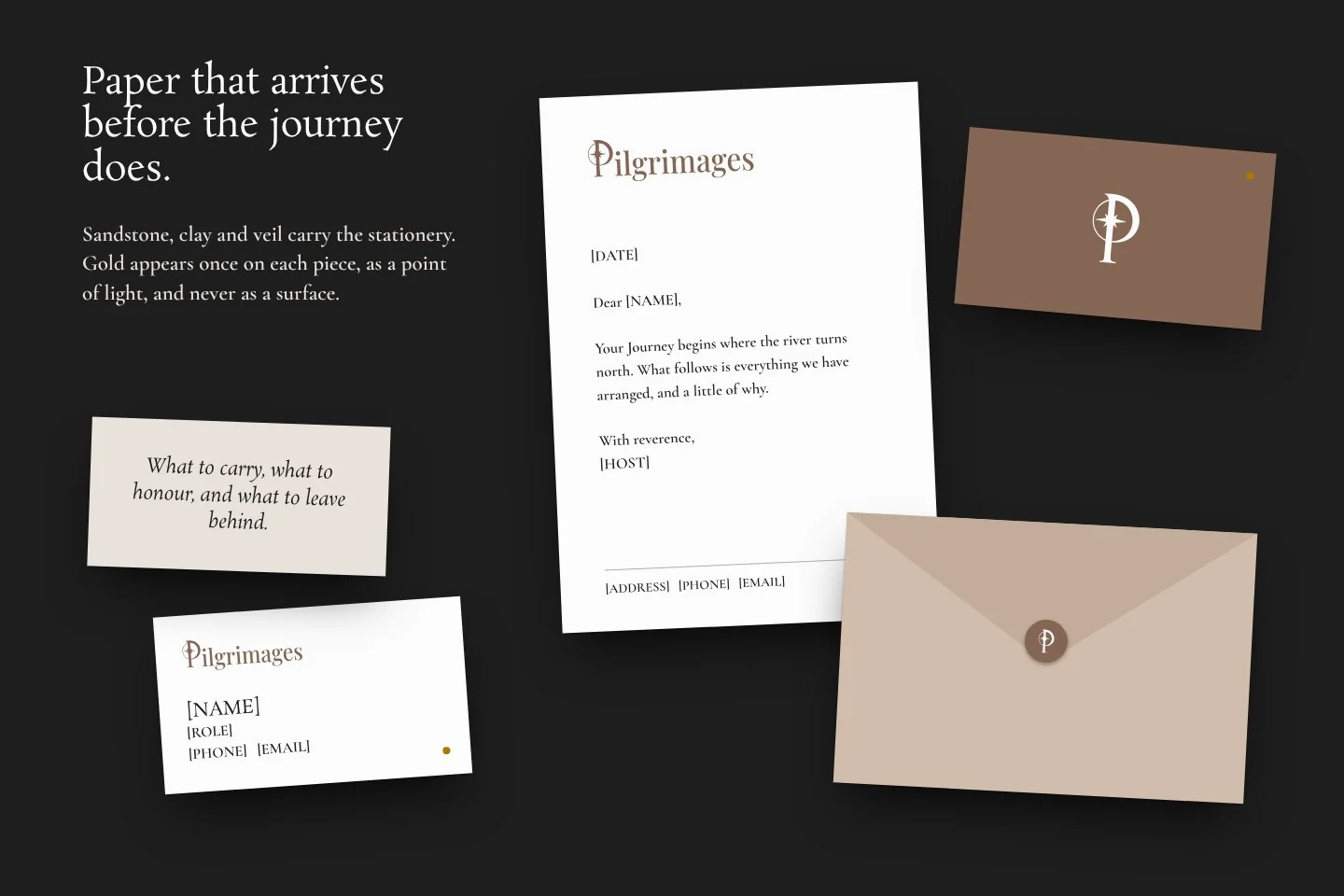
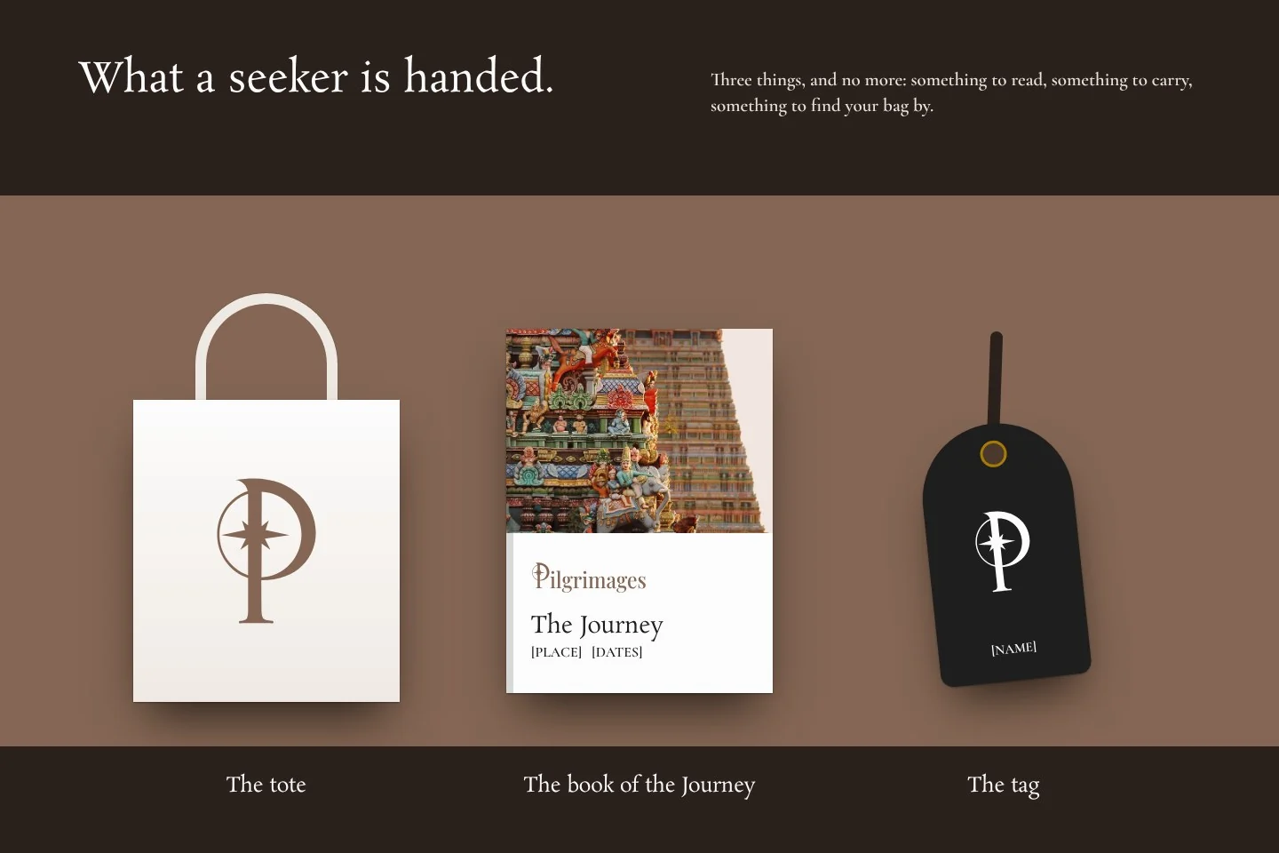
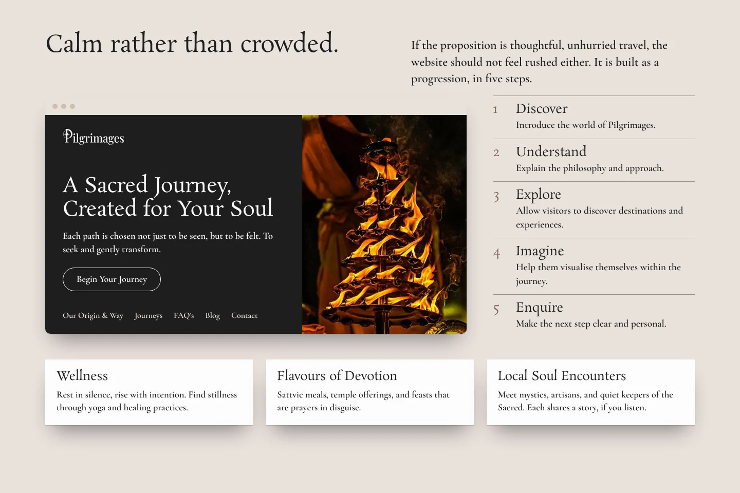
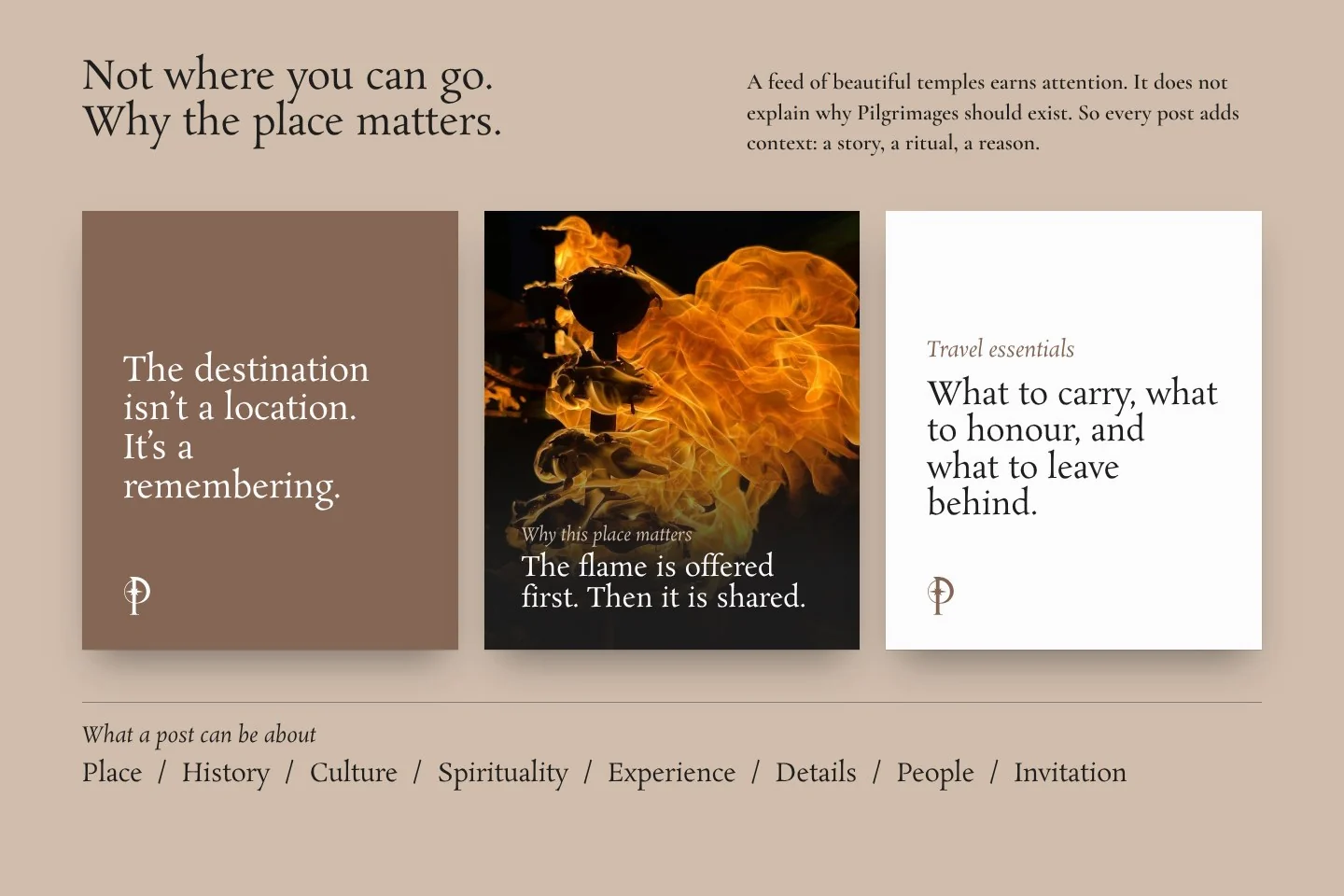
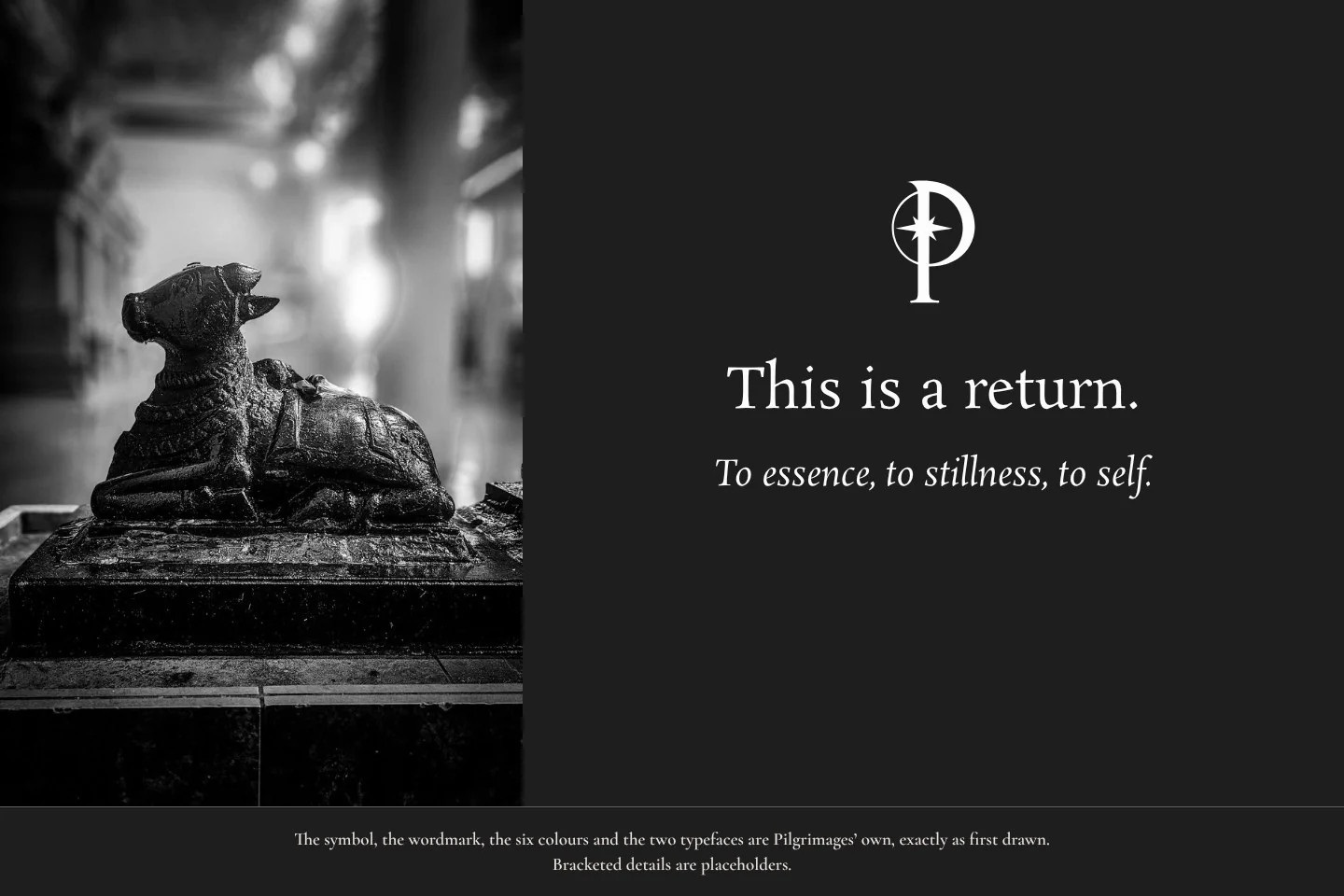
The symbol, the wordmark, the six colours and the two typefaces are Pilgrimages’ own, exactly as first drawn. The pages were re-set by Khatt, with the brand’s photographs and some newly drawn applications.
The first logo direction we presented was the one the client chose.
The rest of the time went into making that idea stronger.
Each part came from the one before it.
Pilgrimages has a position, an audience, a voice, a vocabulary, a visual language, an identity, a web design and a content approach.
Strategy
Positioning, audience and proposition.
Voice and copy
Voice attributes, tone by context, words to use and avoid, a lexicon. Copywriting.
Identity
Compass mark, six-colour palette, type, stationery, brand guideline. Logo animation.
Web
Website design. Development by another team.
Social
Social and content strategy.
Print and direction
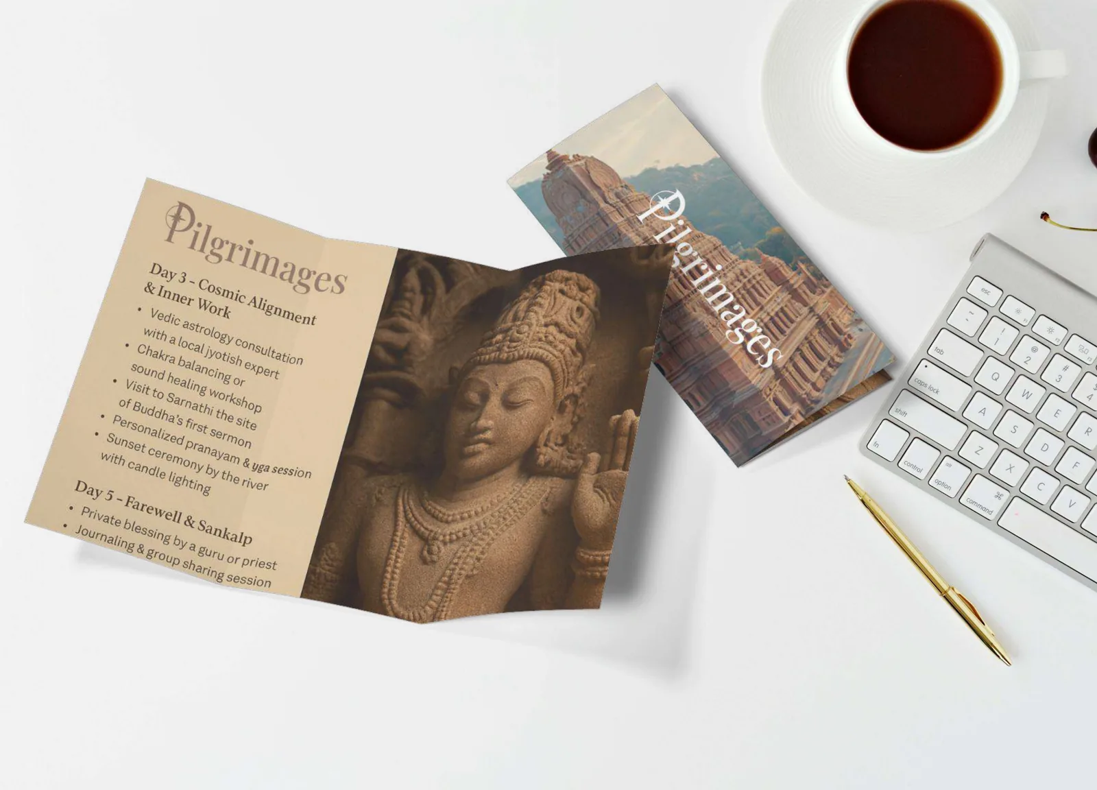
Brochures and collateral. Moodboards and art direction.
That was the short version.
The full story has every decision, the reason behind each one, and more of the work.
P.S.
We did not begin with the logo. We began with what a Pilgrimages journey should feel like.
Looking for something closer to yours?
