


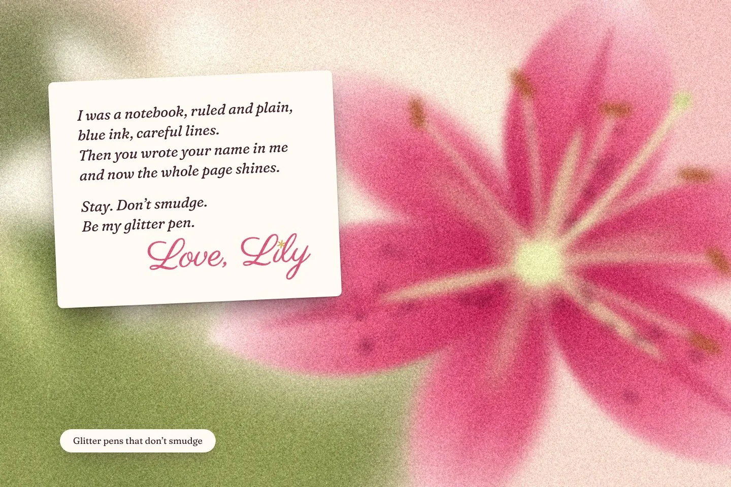
Loancart: the project as one composed image
WorkFinance · Home loans

Financial services don’t have to feel intimidating.

Loancart

Identity systemBrand manual

Industry
Finance: home loans and refinancing
Type of work
Identity system and brand manual
Khatt’s role
Identity system, made in collaboration with a partner studio
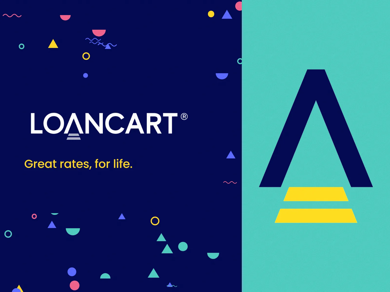
The Loancart logotype on its pattern
Logotype, on the Loancart pattern
The brief

Clear, contemporary and approachable.

Loancart offers home loans and refinancing. It needed an identity that could carry financial services across consumers, employers, media and stakeholders, and stay consistent on every surface.

What we noticed

The customer is not after a loan. They are after a home.

The category can easily become serious, corporate and intimidating. Most financial symbols are abstract.

The question

How do you make a home loan feel less intimidating, and still look like finance you can trust?

The making: the symbolDecision, and why

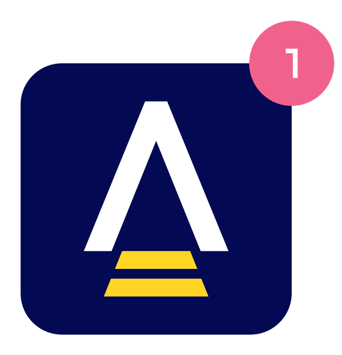
The letter A becomes a home. The two lines beneath it are stairs.

It connects the category to something tangible, and to the idea behind the brand: open doors.

Deep Sapphire is paired with Cadmium Yellow.

The blue gives a financial brand trust. The yellow brings optimism into a serious category.

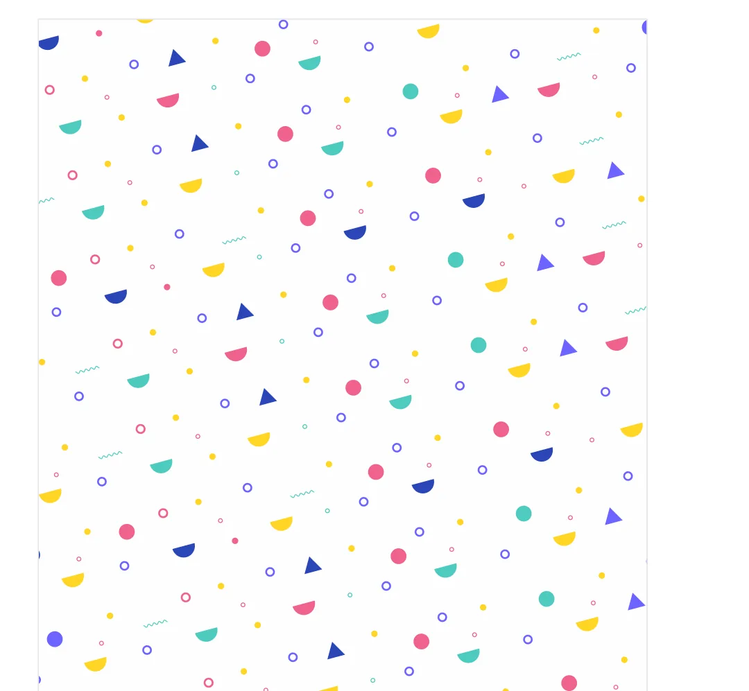
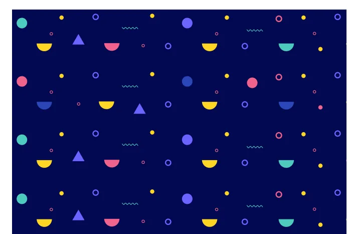
A pattern of small geometric forms travels across every application.

It creates recognition through visual language, so the logo does not have to dominate every surface.

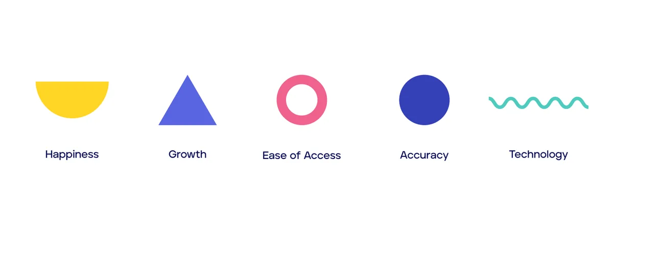
Five traits sit behind the graphic elements: happiness, growth, ease of access, accuracy, technology.

The graphics reinforce a personality. They are not decoration.

The manual shows what not to do as clearly as what to do.

An identity has to survive different teams, vendors and channels.

Minimum sizes are fixed: 25 × 31 mm in print, 15 × 18 px on screen.

The mark was designed to behave consistently, not only to look good.

The Loancart symbol: an A shaped as a home, with two steps beneath
The symbol
The symbol as an app icon
App icon
The Loancart pattern on white
The pattern
ColourEach colour, as a material
Deep SapphireIntelligence and professionalism.
#030952
Cadmium YellowOptimism, hope and freedom.
#FFD525
BegoniaWarmth, and a welcoming quality.
#F0628C
TurquoiseFreshness and balance.
#4FCBBF
Five graphic elements, one for each trait
Five traits, five elements
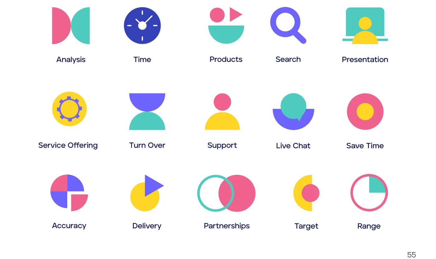
The Loancart icon set
Iconography
Type

Three layers.

Aventa is the brand typeface. Caros is the secondary. Poppins carries the same clarity on the web.

The message

Great rates, for life.

The tagline, beside the line “Your personal guide for home loans.” Guidance, and value.
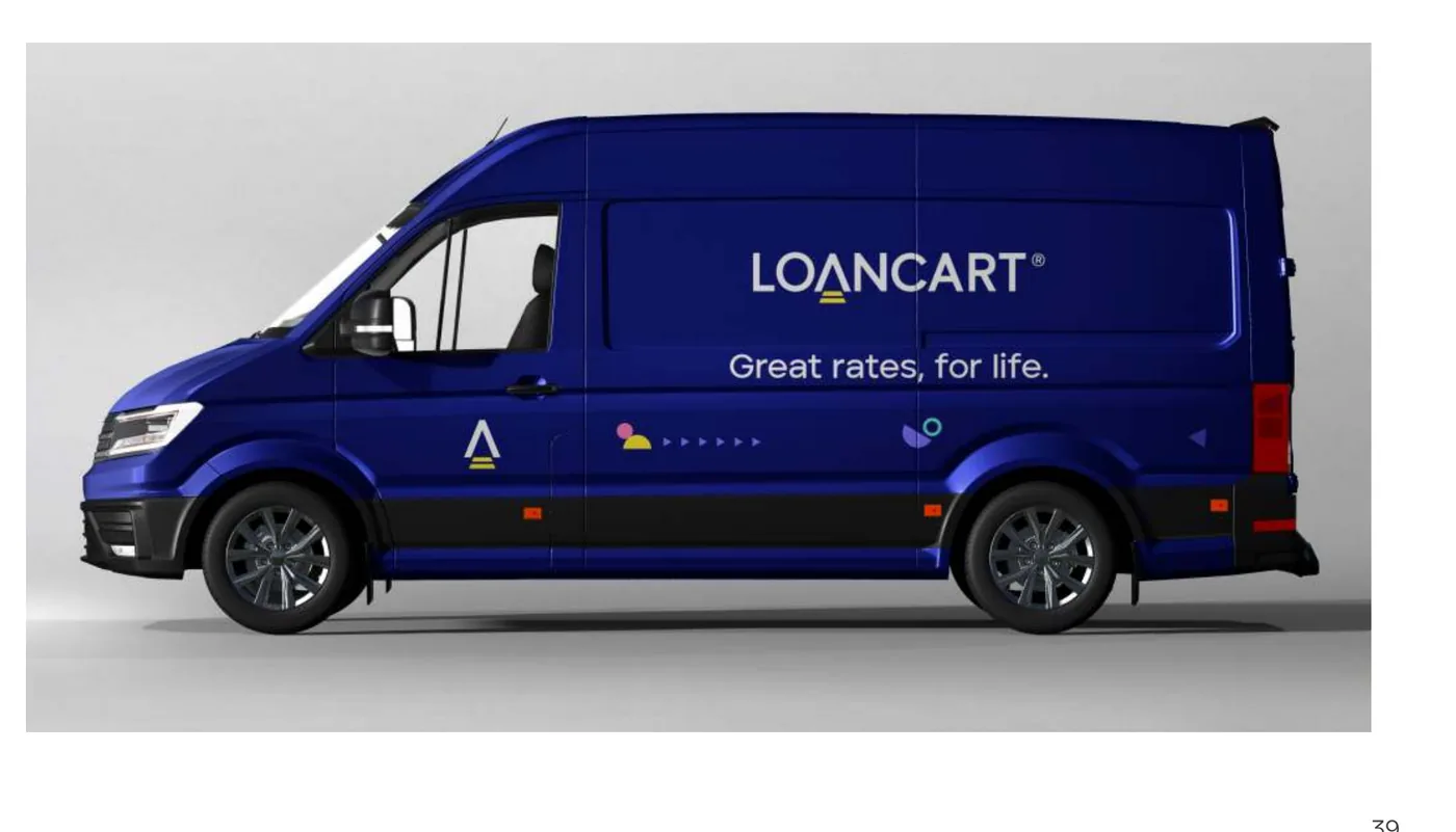
A Loancart van in Deep Sapphire
VehicleBrand manual
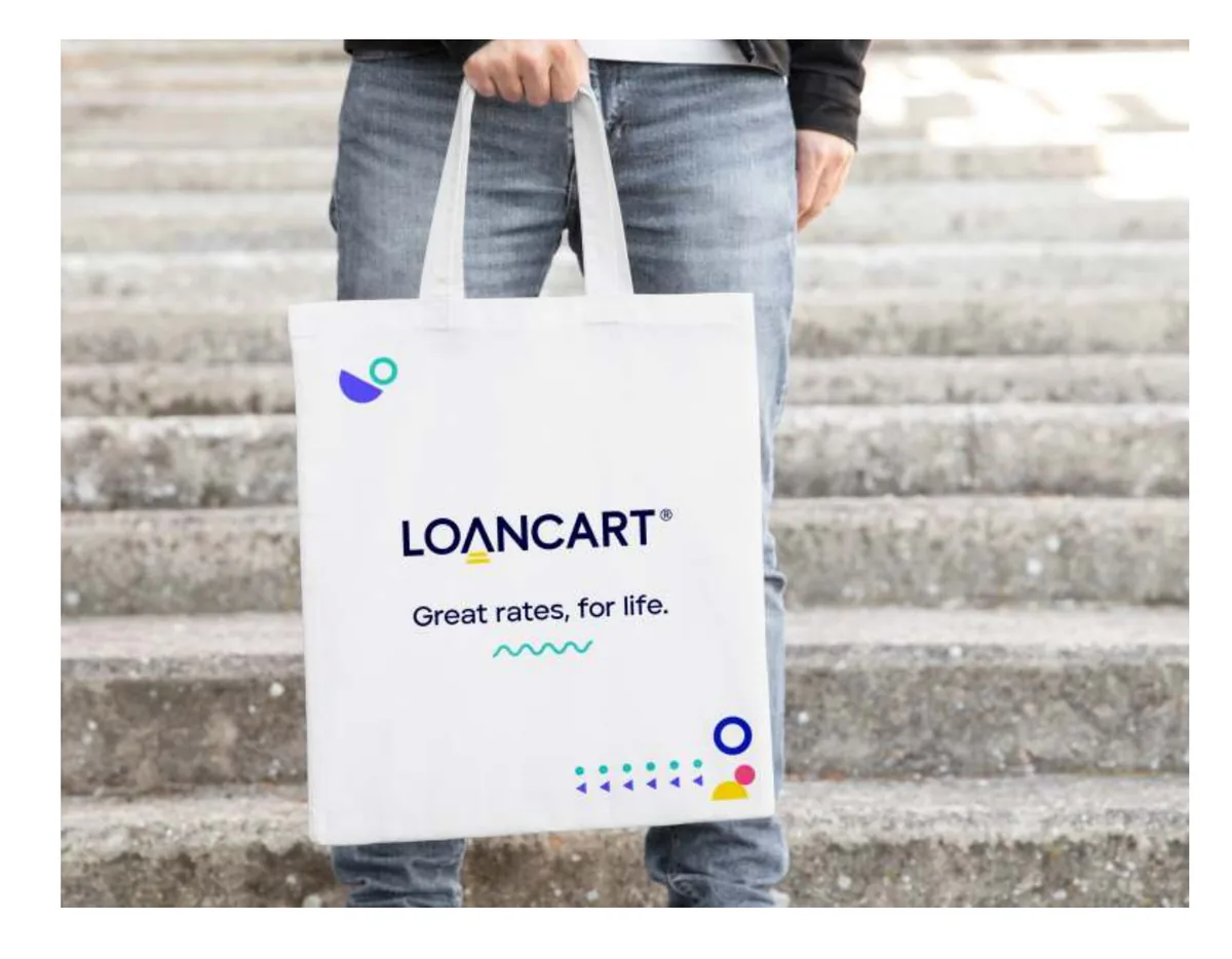
A tote bag with the logotype and tagline
MerchandiseBrand manual
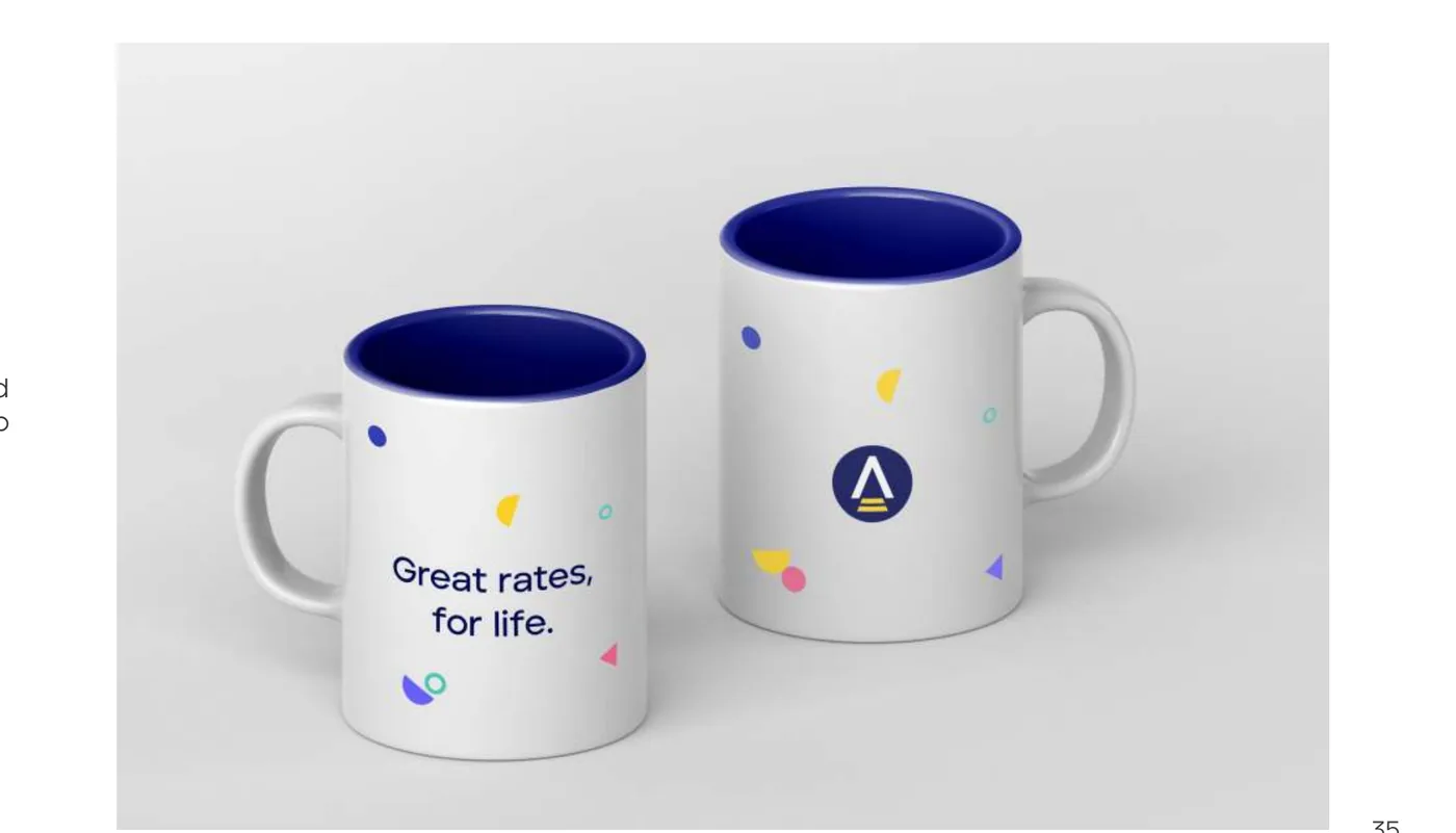
Two mugs carrying the pattern and symbol
MerchandiseBrand manual
The system
SymbolLogotypeColourTypeVisual languageApplicationCommunicationDigital

One brand, one voice: stationery, merchandise, vehicles, presentations, advertising, photography direction and icons all follow the same rules.

The result

A set of rules for how the brand behaves.

The identity is much more than a logo. It takes a financial brand from its core idea to every customer and stakeholder touchpoint.

Exactly what Khatt did

Identity

Symbol, logotype, clear space, minimum sizes, colour and type systems.

Visual language

Brand elements, pattern, shape language, iconography, photography direction.

Corporate

Visiting cards, letterhead, envelope, presentation templates.

Marketing

Advertising layouts, vehicle branding, merchandise.

Digital

Web typography, app icon, profile icon.

With

Made in collaboration with a partner studio.

That was the short version.

The full story has every decision, the reason behind each one, and more of the work.

P.S.

A brand system designed to open doors.
with love, Khatt

Looking for something closer to yours?

Write to us
Next projectHome and livingH&O Bengaluru

Write a Khatt

For someone you love.
Someone you miss.
Someone you never got to tell.

Private by default. Nothing is kept unless you choose to leave a line.

Have something in mind?

Much of what we have made is under NDA, unreleased, or the client’s own to show. Tell us what you are looking for. Where we are allowed to, we will send you something relevant.

Type of work
What is it for?

Thank you. We will read this properly and reply within two working days with what we can share. Some of it may arrive with a confidentiality note of its own.

Preview only: this form is not connected yet, so nothing was sent.

Notes

Things we noticed: observations on brands, culture, language and the craft of communicating. The first notes are being written. Leave your email and we will send them when they are ready.

Thank you. You will hear from us when the first note is up, and not before.

Preview only: this form is not connected yet, so nothing was sent.

Five Letters

Five pro bono spots, for people and organisations doing work that supports women: their safety, their voices, their work, their dignity. If you know who one of these letters is for, tell us. We will read every nomination, choose five, and write back.

Thank you for carrying this letter. We will read every nomination and write back.

Preview only: this form is not connected yet, so nothing was sent.

Write a letter to us

For people who would like to work with Khatt: designers, writers, strategists, social leads, researchers and video makers. No form letter needed. Tell us what you do and what you notice.

Thank you. Your letter is with us. We read every one.

Preview only: this form is not connected yet, so nothing was sent.